User Experience Guidelines for User Connections
This guide, will help you implement the connection between an SAP Concur user’s account and your application. You will find best practices for user-centered design, examples of dos-and-don’ts, and suggested steps to guide the user through the connection process.
Observing these guidelines will help provide consistency across all our partner applications and help ensure that our shared users have positive experiences.
Branding
Please follow your own brand colors, font, and style. For mentions of your partnership with SAP Concur, please refer to our SAP Concur brand guidelines.
A word on accessibility
This guide also includes some suggestions on how to ensure your site is Section 508 compliant. At SAP Concur, we work hard to make sure our critical services are available and usable by every employee at the companies who use our products.
Account linking example
This section provides an example of the process for an end-user (consumer) to connect their SAP Concur account with your application. Note that not all steps below will apply to all applications. This guide, however, attempts to cover the common variations.
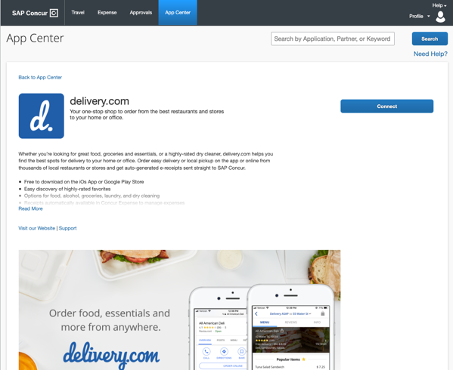
The connection flow begins from the SAP Concur App Center. Once the user has accepted the terms of the connection, the user will be redirected to your site to connect.
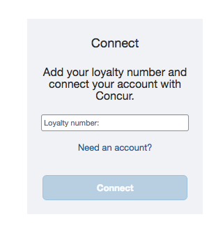
Step 1 Connect
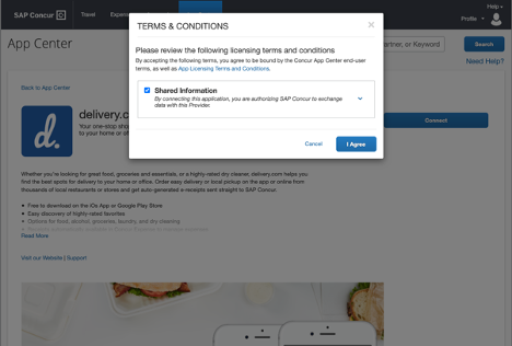
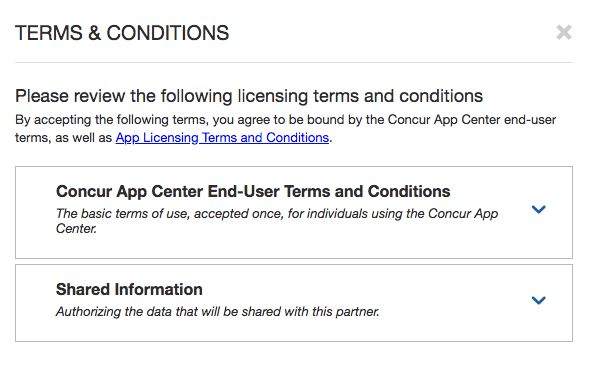
Step 2 Accept Terms
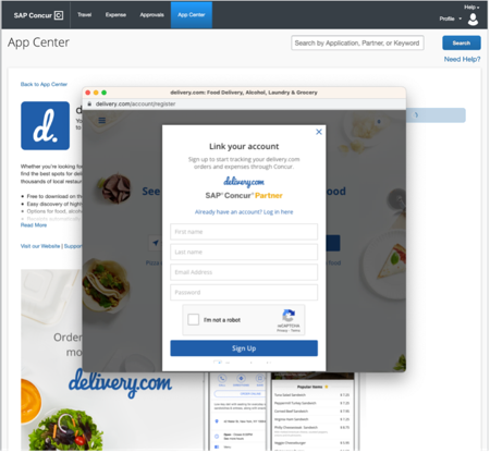
Step 3 Landing Page
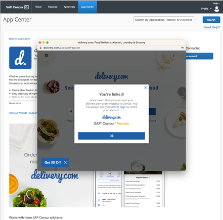
Step 4 Confirmation
Design guidelines
The following guidelines should be used to develop your connection user experience and will be used to evaluate your application during the certification process.
Connect
There are two possible configurations for consumer listings:
Connect
In this configuration Connect is the prominent call to action. This applies to App Center partners and TripLink suppliers without loyalty accounts. This configuration and flow is depicted above.

Connection Request
Connection Request applies to TripLink suppliers with loyalty accounts. For more information on this flow, please refer to the TripLink supplier guide.
Accept Terms
The user accepts the SAP Concur Terms & Conditions. These terms apply to the use of the SAP Concur App Center and data sharing.
Landing Page
This will be the first page the user sees upon redirect from SAP Concur to your application. The SAP Concur App Center will open a new window to your pre-defined redirect URI (referred to as your “Connect URI”). This page should include your brand and the application the customer is connecting to. In addition, the page should clearly indicate that the customer is activating an integration with SAP Concur solutions. The first page should give the user the option to sign in with an existing account or sign up for a new account.
This page should:
- Clearly indicate the integration with SAP Concur solutions in text.
- Include links to your terms and conditions and privacy policy.
- Include links to your “support” and “help” options.
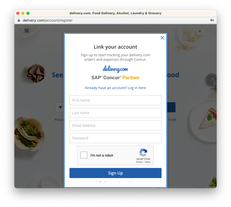
Account Creation
To encourage users to complete registration, it is recommended that this page only include necessary information to create the account. Account details can be pre-populated in this form leveraging SAP Concur API’s. For more information, please refer to documentation on the Developer Portal. Once the user submits the form, your application will begin the authentication process. Your Partner Enablement representative will provide the technical details for implementation based on your SAP Concur integration type.
If your account creation process requires multiple steps, provide a progress indicator so the user knows what is required. If the form requires information the user may not have, allow the user to come back and complete the form later and proceed with account creation.
Confirmation
Once the connection is complete, indicate that the connection was successful.
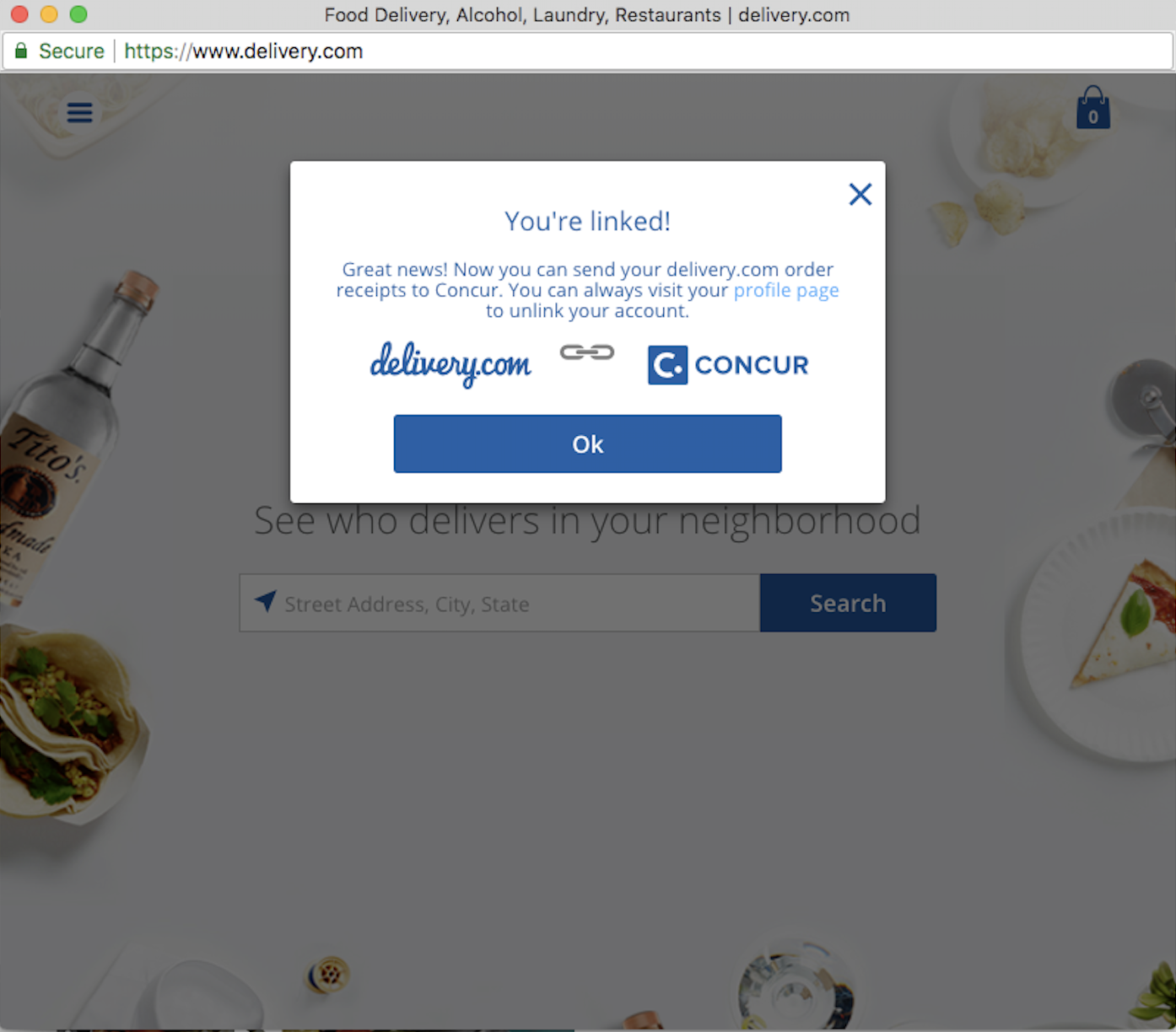
Users should be directed to close the window as the connection is complete and may be redirected to the application home page.
Guideline Checklist
This section provides a summarized checklist of the required and recommended components of your account linking flow. For more details, please refer to Design Guidelines section above.
“Must” indicates required. Recommendations are provided for an optimal user experience.
Landing Page(s)
- All pages:
- Must support a form factor of 800x600. (required)
- Must provide back/forward navigation, where applicable. (required)
- Should be Section 508 Compliance (strongly recommended)
- Should include support and help options clearly throughout the process.
- Should adhere to your company’s brand and marketing guidelines.
- Must include your company branding and specific application brand, if applicable. (required)
- The first page (at a minimum):
- Must clearly indicate this is an integration with SAP Concur solutions. (required)
- Should include links to your terms and conditions and privacy policy. (strongly recommended)
- Should include links to your support and help options. (strongly recommended)
Account Creation
- Should include a progress indicator. (recommended)
Confirmation Page
- Must have an indication that the connection was successful. (required)
- Must provide next steps. (required)
Disconnect
- Users should be provided with a method to disconnect within your portal. Please see documentation for revoking a token on the Developer Portal. (strongly recommended)
Accessibility best practices
Provide text alternatives
Providing text alternatives for non-text content ensures that individuals with visual impairment are still able to understand your site or application. SAP Concur recommends providing short text alternatives for images, which makes your image content nearly as accessible as your text-based content. This allows special technology such as screen readers to read your content aloud to a user with visual disabilities.
Distinguishable content
Make it easy for users to see and/or hear content by:
- Clearly separating foreground from background.
- Making sure color is not used as the only visual means of conveying information, indicating an action, prompting a response or distinguishing a visual element.
- Using readable fonts, making sure any text is at least 14 points and has good contrast (a minimum of 4.5 to 1 color contrast between the text and background color is recommended).
- Providing a highly visible highlighting mechanism for links or controls when they receive keyboard focus.
These design elements help make the user experience better for all users, but especially those who are visually impaired or color-blind.
Keyboard control
All functionality of your site or application should be operable through a keyboard interface without requiring specific timings for individual keystrokes. Providing keyboard input mechanisms helps users with visual impairments or mobility issues to use your site without having to point-and-click on objects they cannot see. The keyboard interface can be combined with mouse input or other input methods, to support all users.
Predictable structure
Make all pages appear and operate in predictable ways by:
- Positioning labels clearly and near inputs.
- Using consistent navigation patterns across a set of webpages.
Input assistance
Help users avoid and correct mistakes by:
- Hiding optional form fields.
- Validating form submissions on the server.
- Re-displaying a form with a summary of errors, if necessary.
- Providing error notifications as the user enters information, including error notification information in the page title.
- Highlighting or visually emphasizing errors where they occur.
For further information on accessibility for you and your team, we recommend: